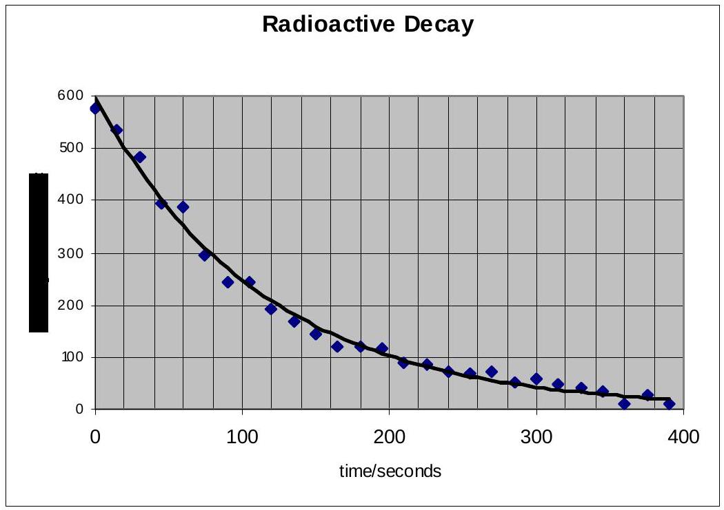
The graph above plots the measurements of the radioactive decay of an element, along with a line of best fit. Why do some of the data points not lie on the line of best fit, but appear above and below it?
A. Not all of the $\alpha$ or $\beta$ or $\gamma$ radiations are measured
B. The source decays in a random manner
C. The background count is not zero
D. Inaccurate measurements by the experimenter
Reveal answer
Show worked solution
This question asks about the scatter of data points around the line of best fit in a radioactive decay experiment.
Understanding radioactive decay:Radioactive decay is a fundamentally random process. While we can predict the average behavior of a large number of nuclei (exponential decay with half-life), we cannot predict exactly when any individual nucleus will decay.
The experimental setup:In a typical radioactive decay experiment:
- Count the number of decays per time period
- Plot count rate vs. time
- Data points won't fall exactly on the theoretical curve due to statistical fluctuations
Why data points scatter:
This randomness is inherent to quantum mechanics. Even under identical conditions:
- Different runs of the experiment give slightly different results
- The measured count at any time varies around the expected value
- This is not experimental error - it's fundamental to the process
Evaluating the options:
A. Not all radiation measured - This would be systematic error, not random scatter B. Random decay - This correctly identifies the inherent randomness C. Background count - Would add constant offset, not random scatter D. Inaccurate measurements - Human error, but not the primary cause
The scatter around the line of best fit is due to the random statistical nature of radioactive decay.
Answer: B (The source decays in a random manner)